Project information
- Category: Print
- Client: Greater Fall River RE-CREATION
- Project date: September 6, 2018
- Project Documents: Fall Program Proof PDF
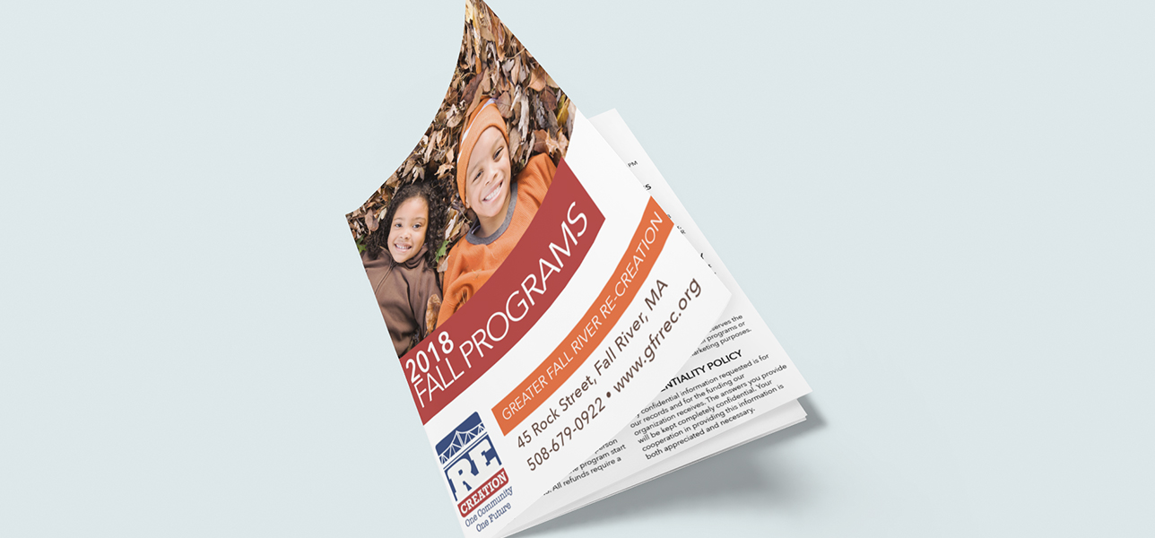
RE-CREATION Fall Programs Booklet
As a non-profit recreation and prevention based organization, Greater Fall River RE-CREATION provides a range of programs to a lower income demographic with socioeconomic challenges. When I was first hired by RE-CREATION and was reviewing the current collateral in the market, I learned that their seasonal program was a poster-sized sheet of paper folded up a dozen times like a map! It wasn’t exactly a user-friendly way to disseminate their seasonal program information, especially to their target audience. I knew right away in order to make this program more accessible for a diverse audience, I would need to redesign the program to be an 8.5” x 11” booklet with clear headings and columns to make it easy to read.
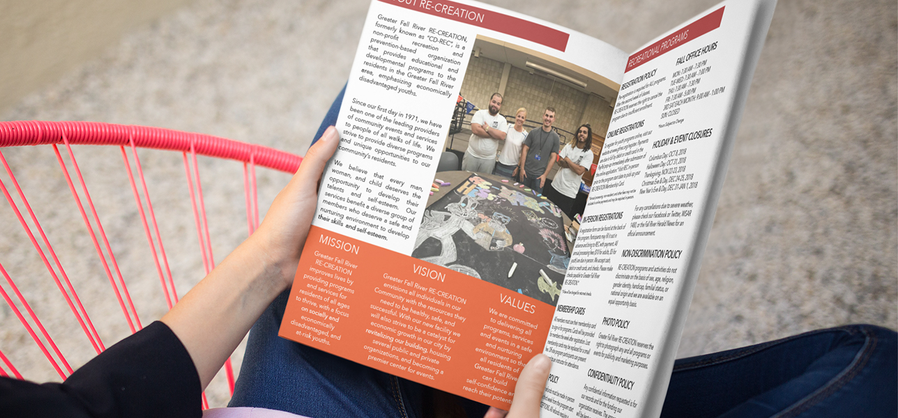
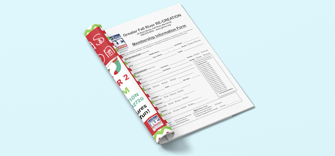
Before starting the design process, I researched program booklets from competitor organizations like the YMCA and the Boys and Girls Club to see how they communicated similar information to a comparable audience. What I found was that the goal should be making the information clear and easy to follow. I implemented a design that utilized bold headings, consistent formatting, and color blocks to help break up large sections of text to provide structure in the template. I also included a strong call to action by including a membership form at the end of the booklet to boost the number of applications and make registering even easier for the audience. This decision demonstrates the ability to creatively and strategically transform the booklet into a more practical design that takes the physical, cognitive, and social challenges of the audience into consideration.
Working with a small team consisting of the Executive Director and Program Coordinator, we utilized a simplistic, straightforward strategy when it came to communication with the target audience. It was through this collaboration with the stakeholders that the final product provided clear communication to a multi-cultural, multi-lingual audience. To address the needs of the project, I worked constructively with the clients who critiqued and collaborated with me to create a final product that communicated well with the audience.
The design, created in InDesign using industry-standards, demonstrates the ability to distribute quality print designs. It’s also easily adaptable for online viewing to include on a website or to link to on social media. Because the range of people who would be viewing this piece have a diverse sociocultural perspective, I was careful to use fonts and colors that wouldn’t pose a moral or ethical threat. Photos and graphics were chosen from royalty-free sites to keep costs down and remain ethical while also demonstrating creative balance. I was also conscious to select photos that were inclusive and representative of the target audience so as to relate to them better and communicate with them on a personal level resulting in the design’s ultimate success.