
Project information
- Category: Branding
- Client: BayCoast Bank & Affiliates
- Project date: Ongoing - 2021
- Project Documents: Logo & Color Update;
Stationery Design Concept Presentation
BayCoast Bank Family Rebrand
BayCoast Bank has a long, rich history in the Southeastern Massachusetts and Rhode Island area as a community-focused, customer-centric community bank. Chartered in 1851, BayCoast Bank has grown significantly into a $2.5 billion bank with 23 branches, 500+ employees, and 5 affiliated companies with an additional 19 offices. When I first joined the BayCoast marketing team, the affiliate companies were completely separated from one another, both in terms of information exchange and branding. Each company had its own logo, colors, fonts, personality, and way of marketing themselves. With the addition of a referral reward system to encourage cross-company business and the introduction of a sophisticated Customer Relationship Management (CRM) system, BayCoast and the affiliated brands started to break down the silo and come together as a family to offer a full suite of financial products. One of the most significant parts of this evolution was the unification of the family of brands.
As the sole in-house graphic designer for BayCoast Bank and the family of brands, I was in charge of leading the rebrand project. The first goal was to create visual unity across the brands. To do this, we worked with an external agency to develop a cohesive color palette that would work for each of the unique brands. Since BayCoast Bank already had strong brand awareness and equity within our footprint, the affiliate companies were on board with adopting the iconic BayCoast blue and gold colors as their primary colors. This was a drastic change for Partners Insurance Group in particular whose primary color had been maroon for more than a decade. We also introduced a secondary color unique for each brand so that when presenting the brands as a unit, we could visually differentiate between each of them with this secondary color. In addition, we unified the brand by also changing the brand fonts to be the same across the board, selecting Agenda Bold as the heading font and Frutiger as the subheading font. Thinking ahead to standardizing the look and feel of letters and external communications, I suggested we add Calibri Regular as the brand's body font as opposed to the suggested Frutiger Roman. That way, we didn't need to pay to install custom fonts on all employee computers keeping costs down but still standardizing brand letters.
The second goal of the rebrand was to unify and breathe life into the logos that were created decades ago. Since our brand awareness study came back favorable for the BayCoast brands, our main focus was uniting Partners Insurance Group, Plimoth Investment Advisors, and Priority Funding to have logos more in line with BayCoast. The Partners Insurance logo had the least amount of changes since we mainly changed the color and stacked the text for maximum readability in practical application. The changes to the Plimoth and Priority logos were more dramatic. Previously, Plimoth’s logo was just text in blue Monotype Corsiva. There was no distinguishing brand mark or icon aside from the text. As the project lead, I led our agency on the logo design project and introduced the idea to add a lighthouse icon to Plimoth’s logo. Since BayCoast had waves and Partners Insurance had the sun/moon icon, Plimoth’s lighthouse icon would complete the coastal scene and provide a well-rounded story to the family of brand icons. The senior team loved the idea and the final logo works well with the other brand logos. Similarly, Priority Funding’s logo hadn’t been updated in quite some time. While they did have the benefit of having a distinct brand mark, they did not exercise tight branding standards when it came to consistent colors or type faces. We ultimately updated the logo to a door opening to represent the story that Priority Funding opens the door to your financing needs. Ultimately, the senior team and board members are proud of the new logos and customers are responding favorably to the updates which has been a major success for the brands so far.
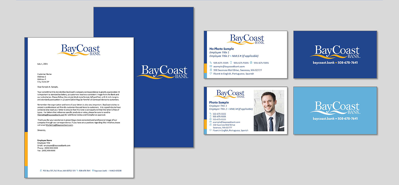
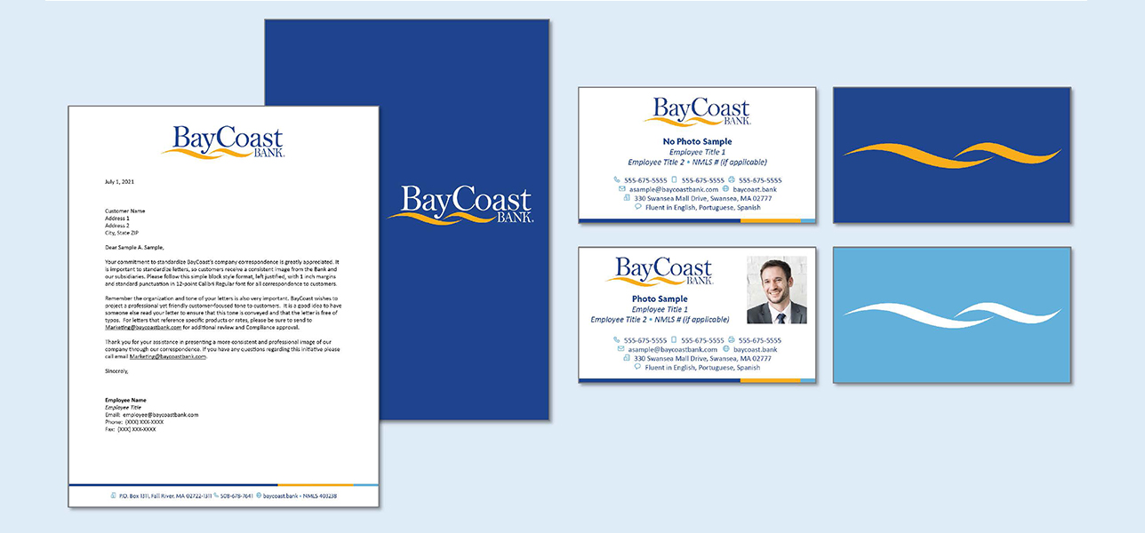
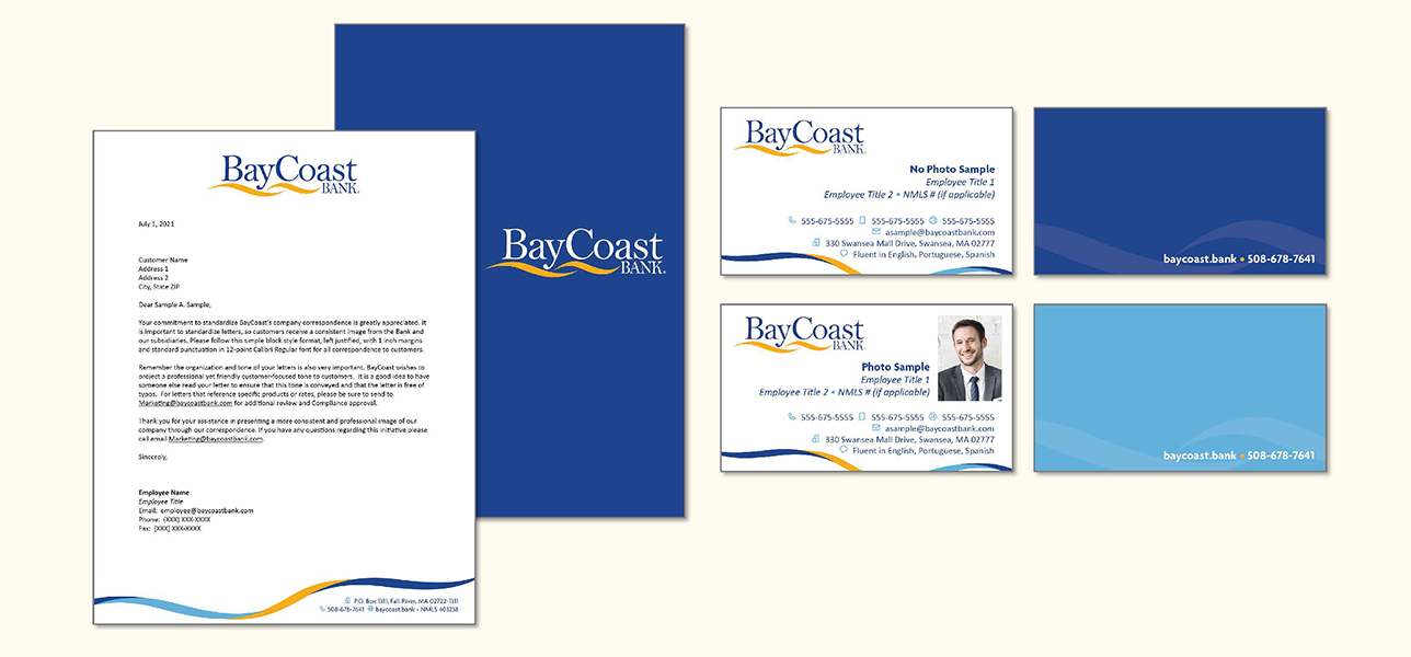
The last major leg of the family of brands rebrand was the update of stationery items. In a perfect world, a customer would have a checking account at BayCoast Bank, their mortgage at BayCoast Mortgage or Priority Funding, their insurance policies at Partners Insurance Group, and their retirement plan at Plimoth Investment Advisors or BayCoast Financial Services. If that same customer would be receiving communications from the various organizations, I wanted to ensure the look and feel of that communication would be unified. Working independently on the stationery design concepts, I wanted to utilize the accent of each brand to differentiate between the brands but use the same design for the entire family of brands. Using a minimalist approach to maintain the new modern look we were after, each design features the blue and gold colors and a touch of the accent color to represent the brand and tie the affiliate companies together. The business cards offer versatility for each brand and are more contemporary than our previous cards. Icons make the information more inclusive of non-English speakers and maintains a clean look and feel to the various items. The senior team has responded favorably to these designs when introduced to them in August 2021. Implementation of the new designs is expected to take place in Q3 2021.