
Project information
- Category: Campaign
- Client: Julie R. Gagliardi
- Project date: March 18, 2018
- Project URL: Postcard PDF
School Committee Election Campaign
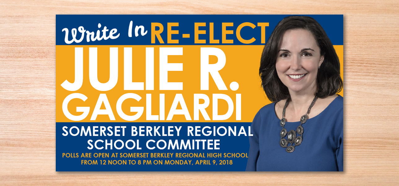
When Julie R. Gagliardi approached me about running for the Somerset school committee, her story touched me. Julie had been on the committee for years but due to a clerical error, her name wasn’t going to be on the 2018 election ballot. Julie was faced with a problem – she had to communicate to the people of Somerset, MA that she was still in the running for the committee, however it came with a catch. Residents would have to physically write Julie’s name in on the ballot in order for her to win.
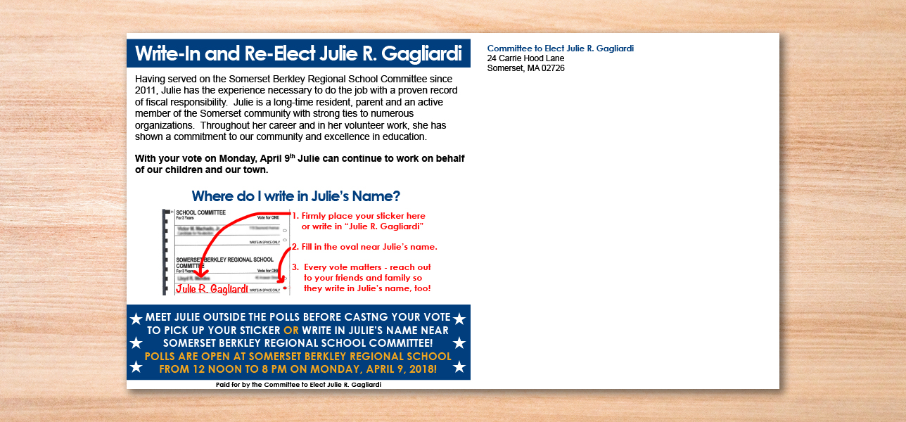
With that problem in mind, we decided to send a direct mail postcard to all Somerset residents. The postcard had to be eye-catching enough for people to read and not just throw away. It also had to represent Julie so that people would remember to write her name in on election day. I decided to utilize the colors of the financial institution Julie works for to tie her to the bank and assist the public in recognizing who Julie was. Coincidentally, blue and gold are also the Somerset Berkley High School colors so relating to the target audience and getting their attention through use of color was easy. Using a large photo of Julie and clear instructions on the back, we were able to creatively target Somerset residents. Attention to detail and a practical approach to communicating information made it simple for residents to remember Julie on election day. Including an image of the ballot and script text on the correct line to write in Julie’s name also helped the audience understand what the call to action was.
There was a lot of strategy and communication between Julie and I when approaching this project. We both wanted to ensure the call to action was clear and easy to understand the who, what, where, when, and why of the mailing. With a strong opening paragraph and visual aids to accompany the call to action, our collaboration was able to produce a professional design within a short deadline that engaged the audience to go on to win the election. In regards to the craftsmanship of this direct mail piece, the design includes CMYK colors and crop marks to ensure an appropriate bleed for the design. Using Adobe Photoshop and InDesign, this postcard was professionally printed and was quite successful in reaching the project’s goals.
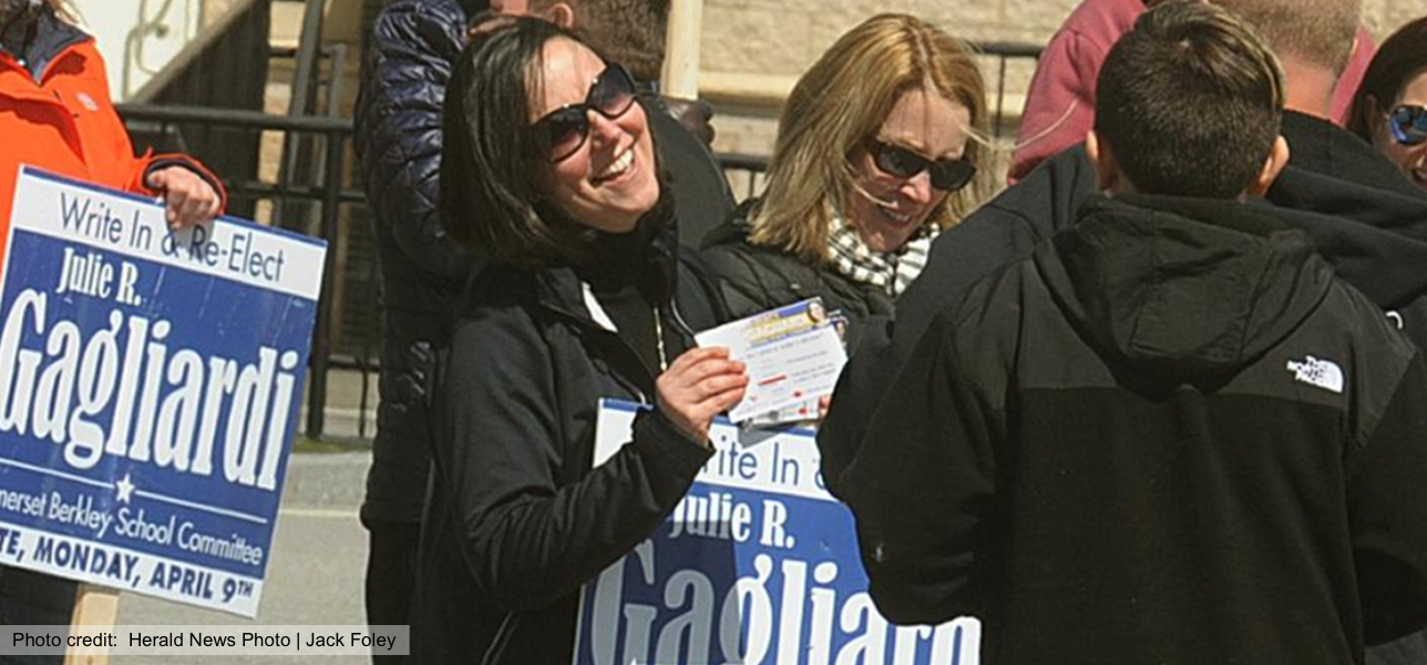
By understanding our target audience and the personal significance behind the selected colors, the design demonstrates the ability to understand the audience’s perspective. The design doesn’t necessarily pose any moral or ethical questions inherent in the graphic design industry, but rather it shows an understanding of how to balance creativity and a persuasive voice to convince the audience to vote for Julie. By including visual elements like the image of the ballot, the design exhibits an awareness that not everyone in the audience may be able to understand English, have the same cognitive abilities, or come from the same background. However, the design is inclusive enough to help a general audience understand the message and call to action. Ultimately, our efforts paid off and Julie won a seat on the committee!